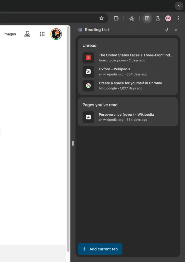
In 2022, Google introduced a side panel UI update for desktop Chrome, initially focused on providing access to Bookmarks. This feature has evolved, and now Chrome is planning to redesign the side panel, eliminating the need for the existing icon.
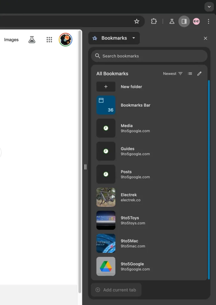
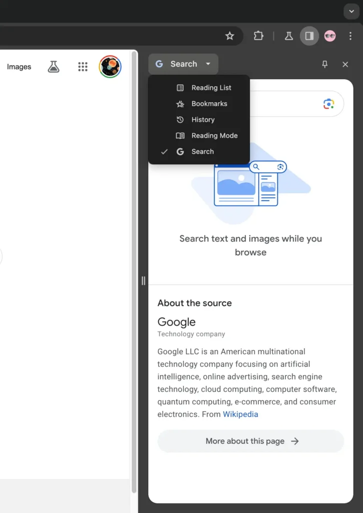
Previously, users accessed the side panel by tapping an icon next to their Google profile avatar. This icon, often square-ish and halfway filled, typically opened Bookmarks in a right-hand column, causing the open page on the left to shrink. Additionally, a dropdown switcher provided access to various side panels, such as Reading List, Bookmarks, History, Reading Mode, Customize Chrome (on the New Tab Page), and Search.
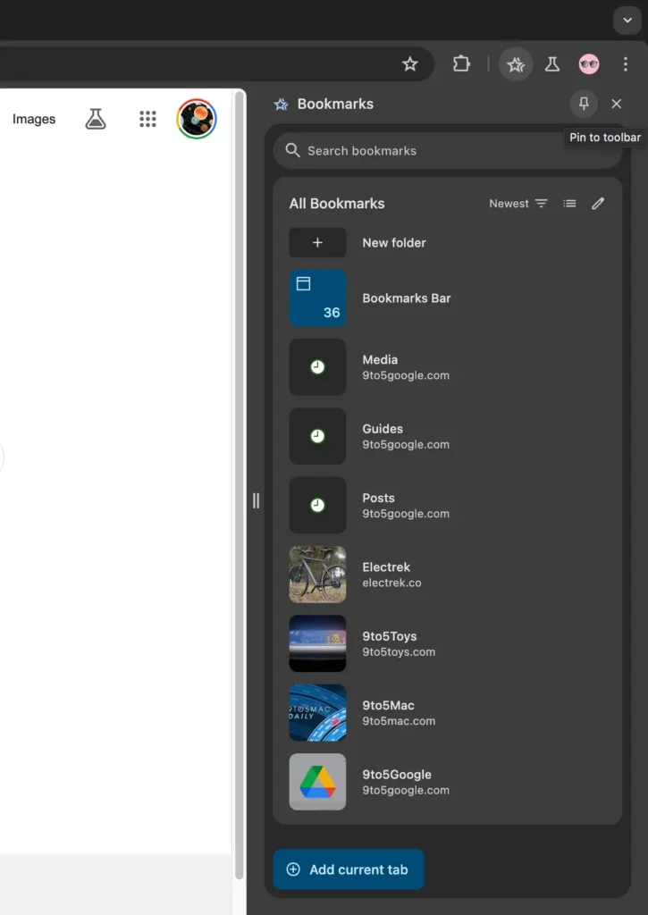
The proposed redesign aims to remove the side panel button and instead allow users to pin individual side panels. Icons for these functions will be positioned to the right of the address bar and Extensions menu, creating a distinct section for side panels with adjustable order settings.
To open a side panel under this update, users can utilize the three-dot menu (Overflow > Bookmarks and Lists > Show All Bookmarks), revealing a pin icon in the top-right corner. However, the process for initially opening the side panel without the button might seem somewhat buried, prompting the hope that Google will introduce an onboarding UI for user convenience (while retaining the dropdown menu).
This is currently available as a flag (in Chrome 121 Beta): “Side panel navigation and pinning updates—Enables support for side panel pinning and navigation updates. – Mac, Windows, Linux, ChromeOS, Fuchsia, and Lacros.”
chrome://flags/#side-panel-pinning
This approach provides flexibility, allowing users to choose whether or not to use side panels. When nothing is pinned (and no Extensions are present), the user interface is streamlined to the Omnibox and account picture. For users who prefer side panels, they can access the ones they want, such as Extensions, more efficiently.
Also Read: Google Chrome Following Feed Now Shows Content By Topic
- Google Chrome’s Latest Update with Memory Saver and Tab Group features
- Google Chrome New Update on Desktop for Safety Check
- Google Maps Latest Update For Android Auto and Cars
- Google May Introduce a Paid Version of Bard Advanced, Enabling Users to Create Custom Chatbots
- WhatsApp In 2024: 3 Upcoming Features You Must Know About
- Google Messages 2024 Schedule Send Issue Affects Some Users
- 1 Comment
- google chrome
- Google Update
- Update
Pingback:5 Secrets to Boost Your Business with Digital Marketing