YouTube Music Updates Menus on Android and iOS for a Modern Look

YouTube Music has introduced a new menu design on Android and iOS, bringing the app’s interface more in line with the main YouTube app. With version 7.24, the familiar three-dot overflow menu now appears as a floating panel with rounded corners, giving it a sleek, modern look instead of the full-width design previously used. Though subtle, this visual update adds to YouTube Music’s dark-themed aesthetic, making navigation feel more seamless.
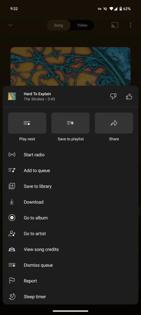
The Cast menu has also received a design refresh, though the sharing menu on Android still retains its original look, which has already been updated on iOS. Despite these visual tweaks, the organization of the overflow menus remains the same, preserving user familiarity and intuitive navigation.
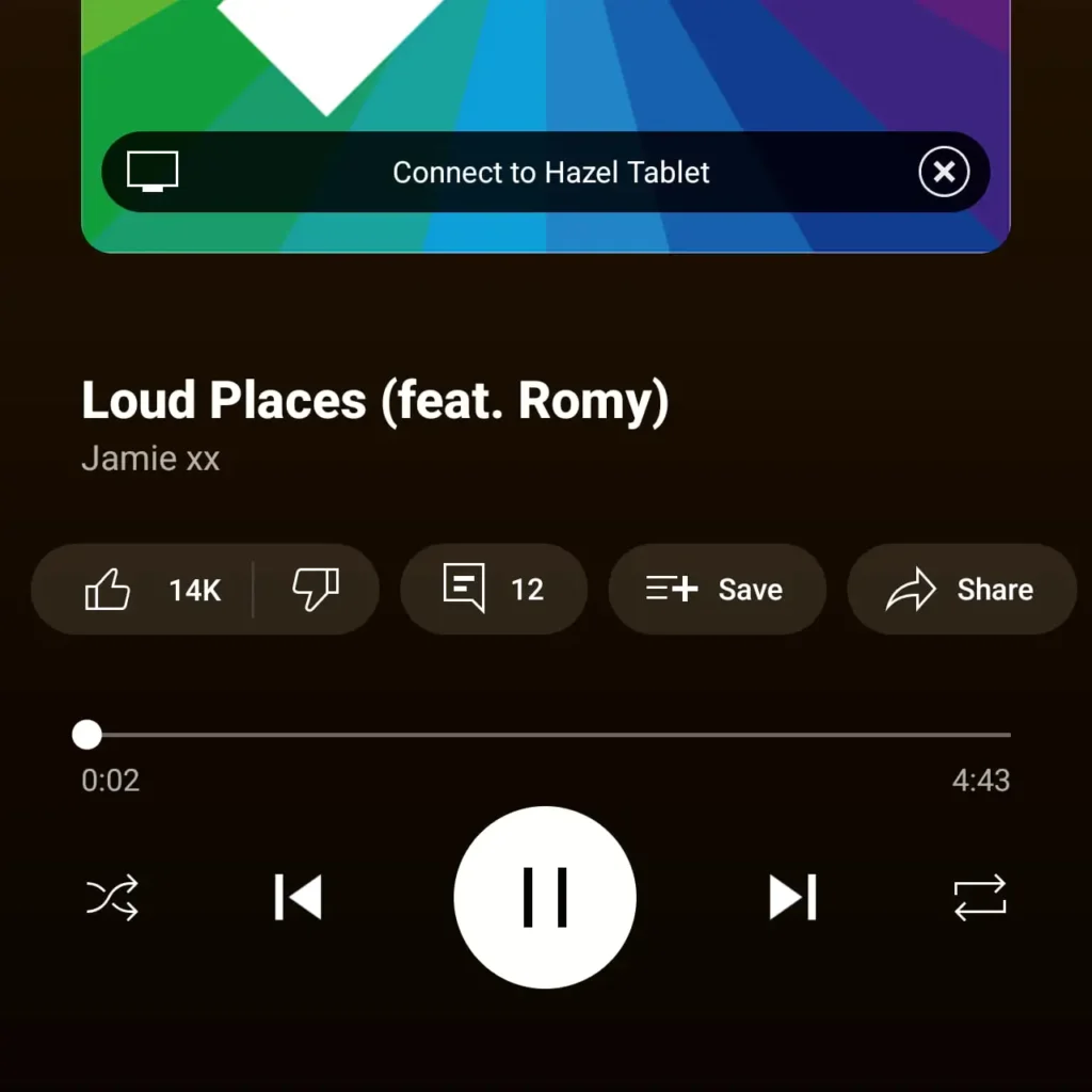
Additionally, YouTube Music recently updated the Now Playing screen to give the “Connect to [Cast device]” button a cleaner, black-and-white appearance by removing the multi-colored glow effect. This new look helps minimize visual distractions, enhancing the user experience.
These updates come as part of a broader trend, with YouTube also rolling out design enhancements to its main app, including new icons, a frosted glass bottom bar, and a refined Home feed icon. While not all of these changes may appear in YouTube Music, the updates signal a more cohesive look across YouTube’s platforms, enhancing usability and aesthetic appeal.
Also Read: Meta Unveils NotebookLlama: AI Podcast Tool with Promising Potential but Challenges Remain
- ChatGPT vs. Gemini vs. Claude: Which AI Chatbot Should You Trust for Your Needs?
- Is Your SEO Strategy Keeping Up with the Times?
- How Can YouTube and LinkedIn Boost Your SEO?
- Transforming Customer Experience with AI, Data, and Automation
- Google Search Ranking Volatility Peaks Again in Late October 2024
- Google Search Demoting Content That Differs Starkly From a Site’s Core Theme
- 6 Essential Facebook Features You Might Not Be Using (But Should!)
- AI Overviews in Search Expand to Over 100 Countries
- Enhance Your Browsing Experience with Chrome’s New Performance Controls







One thought on “YouTube Music Updates Menus on Android and iOS for a Modern Look”