Bing Tests New Local Knowledge Panel Design

Microsoft Bing has begun testing a new layout for its local knowledge panel, presenting local business information in an updated, card-like design. This refreshed interface displays company photos, essential business details, third-party reviews, a map, and other key information, aiming to make the experience more visually appealing and organized for users.
Spotted by Khushal Bherwani, who posted screenshots on X (formerly Twitter), this design overhaul could help users quickly find necessary information such as business hours, address, and contact details while highlighting customer reviews and service categories in a clear, structured format.
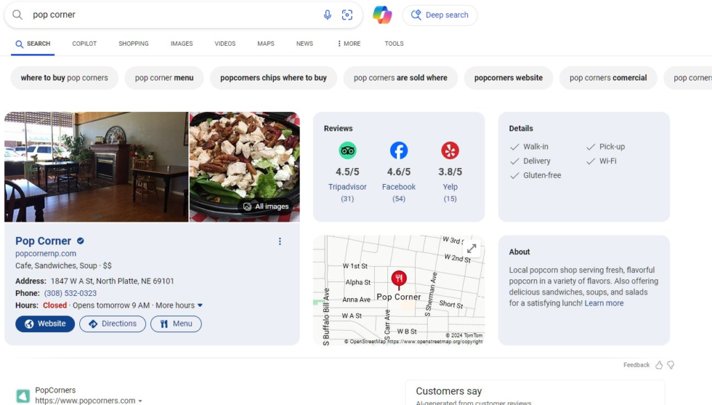
Key Features in the New Design:
- Card-Like Interface: Emphasizes business visuals, letting users view the ambiance and appearance of the venue.
- Organized Information Layout: Key details like operating hours, address, and contact information are prominently displayed.
- Map Location Widget: A map widget offers a quick look at the business location.
- Customer Reviews: Integrated reviews from external sources provide quick insights into customer experiences and popular services.
Here is the test version shared by Khushal Bherwani:
This new design reflects Bing’s commitment to enhancing local search features, allowing users to access organized, detailed local information more efficiently. For further images and details, refer to the screenshots shared in Bherwani’s tweet.
Also Read: Google Rolls Out “Menu Highlights” Carousel for Restaurant Searches
- ChatGPT vs. Gemini vs. Claude: Which AI Chatbot Should You Trust for Your Needs?
- Is Your SEO Strategy Keeping Up with the Times?
- How Can YouTube and LinkedIn Boost Your SEO?
- Transforming Customer Experience with AI, Data, and Automation
- Google Search Ranking Volatility Peaks Again in Late October 2024
- Google Search Demoting Content That Differs Starkly From a Site’s Core Theme
- 6 Essential Facebook Features You Might Not Be Using (But Should!)
- AI Overviews in Search Expand to Over 100 Countries
- Enhance Your Browsing Experience with Chrome’s New Performance Controls











One thought on “Bing Tests New Local Knowledge Panel Design”