Google Gemini’s Latest UI Update Enhances Dark Mode Experience

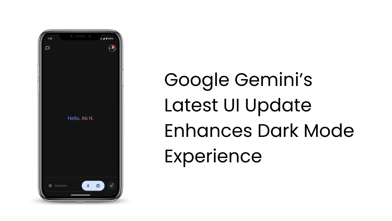
The Gemini app for Android is receiving a new UI update that improves usability, especially in dark mode. Google’s latest tweaks, part of the app’s beta version 15.42, focus on providing a smoother and more visually appealing experience for users who prefer dark mode.
Key Changes in the Gemini App’s User Interface
One noticeable update is the adjustment to the ‘+’ icon for adding attachments, which has been resized and no longer sits within a circular button, making it more accessible and easier to locate on the screen. The microphone and camera icons are now in a pill-shaped container with a gray background when dark mode is enabled, blending seamlessly into the interface. When dark mode is off, the container shifts to a lighter gray, adding a refined touch.
These minor UI adjustments create a more streamlined look for Gemini, offering a less intrusive visual experience that fits comfortably in both dark and light mode. While currently available in beta, this update hints at Google’s commitment to continuously refining Gemini’s design.
Gemini’s Evolving AI Power
Besides UI improvements, Google has been actively enhancing Gemini’s AI capabilities. This month, the app introduced Gemini-powered Summaries in Google Chat, allowing users to quickly review conversations. Additionally, Gemini now supports text-to-speech with the advanced Imagen 3 model, improving its image generation skills and making interactions more dynamic.While Gemini has seen initial hurdles, its frequent updates and simplified interface make it one of the top AI chatbots available. With Gemini 2.0 anticipated soon, these improvements in dark mode and other features show Google’s dedication to creating an intuitive, powerful AI assistant.
- ChatGPT vs. Gemini vs. Claude: Which AI Chatbot Should You Trust for Your Needs?
- Is Your SEO Strategy Keeping Up with the Times?
- How Can YouTube and LinkedIn Boost Your SEO?
- Transforming Customer Experience with AI, Data, and Automation
- Google Search Ranking Volatility Peaks Again in Late October 2024
- Google Search Demoting Content That Differs Starkly From a Site’s Core Theme
- 6 Essential Facebook Features You Might Not Be Using (But Should!)
- AI Overviews in Search Expand to Over 100 Countries
- Enhance Your Browsing Experience with Chrome’s New Performance Controls


